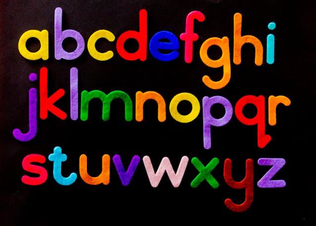
Sans serif fonts have become ubiquitous in contemporary design, from digital interfaces to printed materials. Their clean lines and modern aesthetics make them a go-to choice for designers seeking clarity and versatility. This article delves into the world of sans serif fonts, highlighting their evolution, classifications, and notable examples from TypeType’s extensive collection.
The Rise of Sans Serif Fonts
The sans serif style, characterized by the absence of decorative strokes (serifs) at the ends of letters, emerged in the early 19th century. Initially, these fonts were considered unconventional and were primarily used for display purposes. However, over time, their simplicity and legibility led to widespread adoption across various mediums, including advertising, branding, and digital platforms.
Classifications of Sans Serif Fonts
Sans serif fonts can be broadly categorized into several groups, each with distinct characteristics:
Geometric Sans Serifs
These fonts are based on geometric shapes like circles and squares. They offer a minimalist and modern appearance, making them suitable for both headings and body text. Examples include TT Norms® Pro and TT Commons™ Pro from TypeType’s collection.
Neo-Grotesque Sans Serifs
Characterized by their uniform stroke widths and low contrast, neo-grotesque fonts are functional and highly adaptable. TT Interphases Pro is a prime example, designed for interface use with excellent readability even at small sizes.
Humanist Sans Serifs
These fonts feature calligraphic influences and varying stroke widths, offering a more organic and humanistic feel. TT Fellows and TT Wellingtons are notable humanist sans serifs in TypeType’s portfolio.
Display Sans Serifs
Intended for headlines and display text, these fonts have a more pronounced character and are often used in branding and signage. TT Rounds Neue and TT Frantz are examples of display sans serifs that stand out with their unique designs.
Notable Sans Serif Fonts from TypeType
TypeType, a renowned type foundry, offers a diverse range of sans serif fonts catering to various design needs. Some of their standout offerings include:
- TT Norms® Pro: A geometric sans serif that has been adopted by over 1,000 global brands, including Cartoon Network and Tom Tailor.
- TT Commons™ Pro: A redesigned version of the classic TT Commons, offering improved legibility and a comprehensive character set.
- TT Hoves Pro: A versatile sans-serif with recognizable geometry, suitable for various applications.
TT Fors: A modern geometric sans serif with contrasting character widths, adding a dynamic touch to designs.
These fonts are available in multiple styles and weights, allowing designers to choose the perfect fit for their projects. Many of them also feature variable font options, providing flexibility in design.
Also Read: Clear Formatting for Text Contents in Word Documents
The Versatility of Sans Serif Fonts
The appeal of sans serif fonts lies in their versatility. They are equally effective in print and digital media, from websites and mobile applications to posters and corporate branding. Their clean and modern appearance ensures that content remains legible and aesthetically pleasing across various platforms. Moreover, sans serif fonts often convey a sense of professionalism and clarity, making them a preferred choice for many designers.
Conclusion
Sans serif fonts have transcended their origins to become a cornerstone of modern typography. With their diverse classifications and applications, they offer designers a vast array of options to enhance their creative projects. TypeType’s extensive collection provides high-quality sans serif fonts that cater to various design needs, ensuring that every project achieves its desired aesthetic and functional goals.


